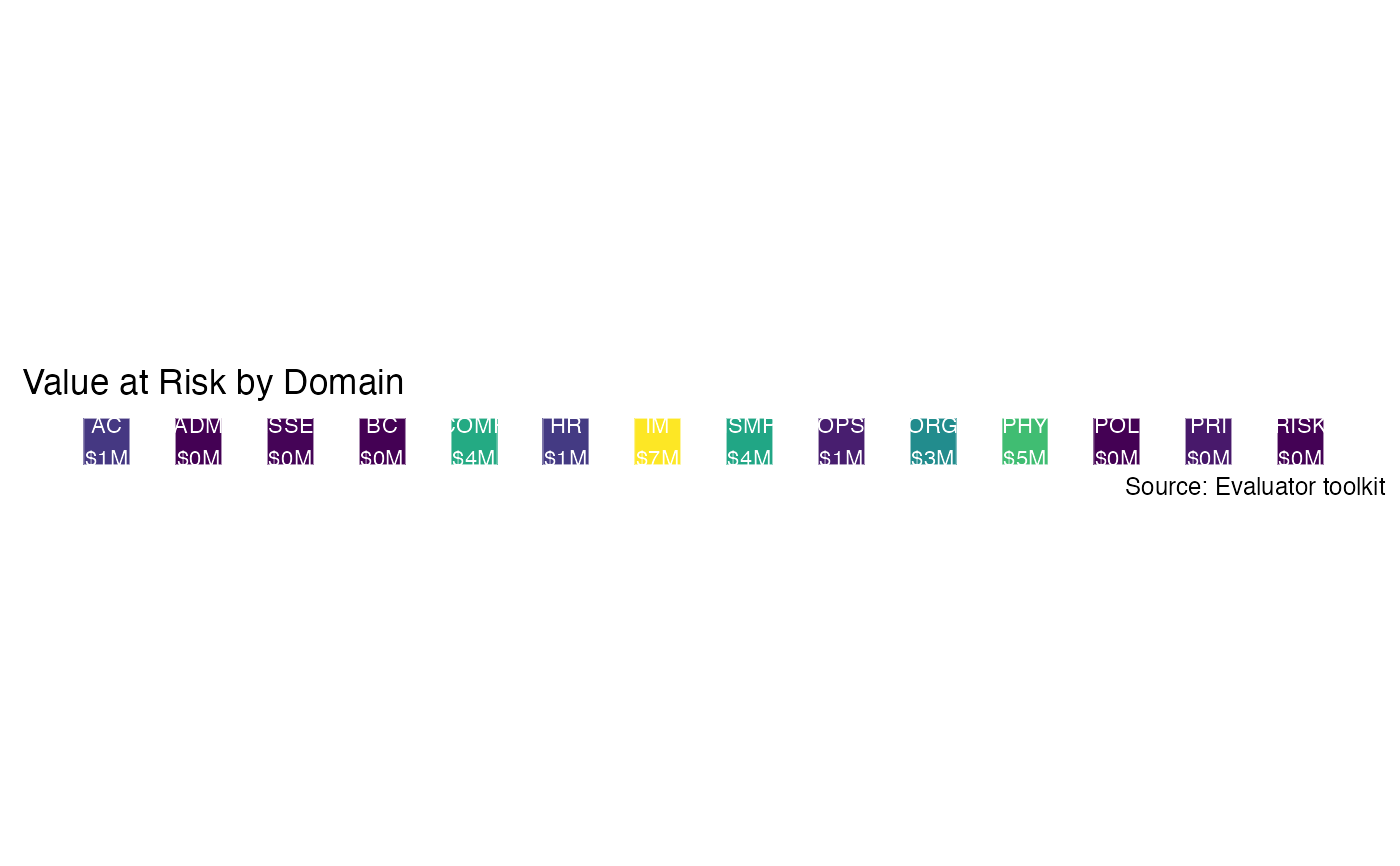
Given a domain_summary and a list of all domains, generate a heatmap colored by the 95% VaR. This plot displays the domains in which aggregate risk is greater than others.
generate_heatmap(domain_summary)Arguments
- domain_summary
Simulations summarized at a domain level via
summarize_domains.
Value
A ggplot object.
See also
Other result graphs:
exposure_histogram(),
generate_event_outcomes_plot(),
generate_scatterplot-deprecated,
loss_exceedance_curve(),
loss_scatterplot()
Examples
data(mc_domain_summary)
generate_heatmap(mc_domain_summary)
#> Warning: It is deprecated to specify `guide = FALSE` to remove a guide. Please use `guide = "none"` instead.